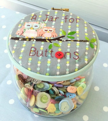
I’ve just finished uploading the patterns from the August issue of the Bustle & Sew Magazine to my store, including one of my favourite projects this month … a Jar for Buttons.

One of my favourite techniques that I’ve used in several designs this month, including this one, is raw edge applique. I love it as it’s so easy to add pops of colour and pattern to mywork. It’s also a great way to use up even the smallest fabric scraps as I hate throwing (nearly) anything away! If you plan to make your own jar you’ll need to choose the fabrics you’re going to use. I could tell you my exact choices, but as it’s unlikely you’ll have exactly the same fabrics in your stash, and because I use a lot of older, or even vintage fabrics that aren’t always readily available, I thought you might be interested in hearing how I select the fabrics I’m going to use for my applique projects.
Choose a medium weight non-stretchy fabric, cotton, linen or a cotton/linen blend is nicest. I personally don’t like working with cotton-polyester mix fabric, to me it simply doesn’t feel right and I never achieve good results when trying to use it. Natural fibres are, in my opinion, by far the nicest to work with and this shouldn’t limit your choice as there are so many lovely designs and collections around these days. You’re going to do a lot of surface work on your fabric, so if it’s too lightweight then it will be difficult to keep it in shape, leading to possible puckering and distortion. If you really absolutely have to use a lighter weight fabric, then consider interfacing to give it sufficient body to work with.
Your background fabric can either – obviously – be plain or patterned. Whichever you choose remember that it is just that – a background. It’s not the main feature, and you want it to showcase your applique work, not fight with it for attention or, perhaps even worse, blend too seamlessly with your applique fabrics so that they sink into the background and all your hard work goes unnoticed. I find that as my applique designs are usually flowing, curved organic shapes, then geometric patterns in just a few colours often work well as the base fabric, providing a good contrast to the applique design. The background pattern should as a general rule be on the same scale, or a little smaller as the applique – so don’t choose an enormous check pattern and position some tiny applique birds on top – it will just look silly.

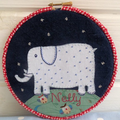
You also need to take into account the colour of your background. Look at it carefully and consider it together with the fabrics you’d like to use for your applique. You may need to tweak your choices a little. Consider if you’re going for a harmonious look – choosing colours and patterns of the same tonal strength as in my Jar for Buttons, or if you’d prefer more of a contrast – like Nelly the applique elephant (above) Either will work well, but each will give a totally different feeling to the finished piece of work.
I always begin with the background fabric as I find it’s more difficult to get right if I’ve decided not to use a light coloured neutral. The fabrics for the actual applique shapes themselves are much easier as I have two large boxes of scraps in my workroom, dating back many years – and almost never throw any fabric away – even the smallest pieces can be useful, for example the baby owl’s chest is only ½” wide! Choose light or medium weight fabrics for the applique shapes for this project as you don’t want to add excess bulk or weight to the jar lid. In general it’s best to avoid large scale bold prints, choose smaller scale prints that won’t draw the eye away from the shapes themselves. For this project a quilting weight cotton is perfect as it is light enough to mount in the hoop without excess bulk, and is also strong enough to hold your applique work.

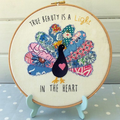
I like to use small stitches worked at right angles to the applique shapes to secure them to the background fabric and may choose either a contrasting or complementary colour floss. In my True Beauty Peacock I used a complementary colour that worked well with all the different fabric scraps I used for the peacock’s feathers and kept to the same colour for the whole tail to bring the different fabrics together in a harmonious whole. Using diferent colours would have given a “bitty” effect. I also (unusually for me) used feather stitch to add an additional decorative element to the design. There are a lot of vintage feedsack scraps in my peacock applique that I chose from a limited colour palette and small repetitive patterns that I feel work well together.

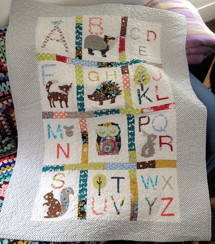
And finally … you don’t have to restrict raw edge applique to purely decorative items. Most recently I’ve used the technique for my Woodland Alphabet Quilt. A combination of securing the shapes with Bondaweb and then covering the edges with a closely-spaced zig-zag stitch worked in invisible thread means that although this quilt has already been washed several times it’s standing up well to the wear and tear imposed by an active baby boy!
Love those sleepy owls.
Aw thanks xx